I posted this on Thursday, but Blogger managed to delete it....Anyway, I've reached another basing bottleneck and in order to maintain momentum I thought I'd post on some other stuff that I've been painting. Specifically, I have been experimenting recently with the new Foundry flesh palettes. I am an obsessive buyer of paints (in the same way that some people are obsessive buyers of rules) and when I saw Foundry advertise sets for various flesh tones I didn't hesitate to buy the complete set. That was also because recently I've found myself painting stuff that falls outside the core remit of this blog and which lends itself to these new paints. Most of the sets concern a particular ethnic flesh tone: "near eastern flesh"; "oriental flesh", "south american flesh" and so on.
So I'm going to post a few observations on my experiments with these paints in the hope that people might find them useful. I've set myself some rules: I'm allowed my usual dark brown ink wash on the faces and hands, but otherwise I have to use the paints "as is", straight from the pot without any mixing or blending. I've tried 3 palettes so far, with more to come shortly.
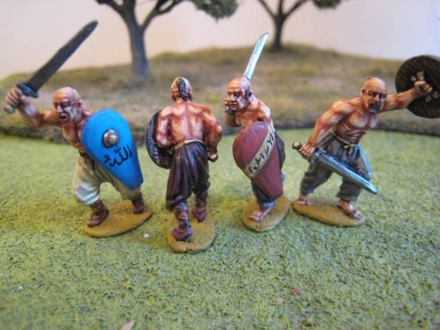
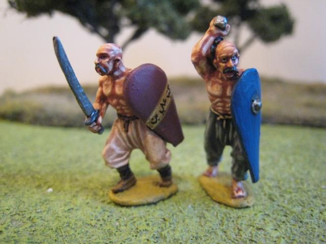
First up are some Perry Miniatures First Crusade "Azabaijani swordsmen", painted using the "Expert Flesh 127" palette. I confess that I can't find these troops in any of the First Crusade army lists I've been looking at, but I suppose they are essentially Turkish light infantry from the southern Caspian Sea area. The "Expert" palette is a double set of 6 paints, rather than the more usual 3 paints. Foundry helpfully label the dark "A" paint "Dark" and the lighter "E" paint "Light" in case you can't work out which end to start with... The "A" shade is darker (or rather, more orange) than the original "Flesh 5" palette. However, "Flesh 5A" is clearly "Expert Flesh 127B"; "Flesh 5B" is "Expert Flesh 127C" and "Flesh 5C" is "Expert Flesh 127E", so the original colours are incorporated into the set.
I found this set easy to use. The tones blend pretty well "out of the pot" and I was delighted to find that the consistency of the paints was thicker than other recent Foundry offerings - I have not been impressed with some recent Foundry purchases which show a reduction in the amount of pigment and a general watery-ness. Personally, I think that the entire palette is probably best used on larger areas of flesh and would be excessive on faces and hands (i.e. the standard flesh areas for 18th century figures). On bare torsos and the like, however, the ease of use of these 6 colours means that painting is quite straightforward, if a little "by numbers". The "F" colour is very light and you'd probably want to blend it in to the previous colour. I'm sure that the results will seem a little excessive for some, but I'm reasonably pleased with the outcome.
Lots of stuff is being based at the moment, for te AI and FCW. Here's some Lee's Legion infantry:


So I'm going to post a few observations on my experiments with these paints in the hope that people might find them useful. I've set myself some rules: I'm allowed my usual dark brown ink wash on the faces and hands, but otherwise I have to use the paints "as is", straight from the pot without any mixing or blending. I've tried 3 palettes so far, with more to come shortly.
First up are some Perry Miniatures First Crusade "Azabaijani swordsmen", painted using the "Expert Flesh 127" palette. I confess that I can't find these troops in any of the First Crusade army lists I've been looking at, but I suppose they are essentially Turkish light infantry from the southern Caspian Sea area. The "Expert" palette is a double set of 6 paints, rather than the more usual 3 paints. Foundry helpfully label the dark "A" paint "Dark" and the lighter "E" paint "Light" in case you can't work out which end to start with... The "A" shade is darker (or rather, more orange) than the original "Flesh 5" palette. However, "Flesh 5A" is clearly "Expert Flesh 127B"; "Flesh 5B" is "Expert Flesh 127C" and "Flesh 5C" is "Expert Flesh 127E", so the original colours are incorporated into the set.
I found this set easy to use. The tones blend pretty well "out of the pot" and I was delighted to find that the consistency of the paints was thicker than other recent Foundry offerings - I have not been impressed with some recent Foundry purchases which show a reduction in the amount of pigment and a general watery-ness. Personally, I think that the entire palette is probably best used on larger areas of flesh and would be excessive on faces and hands (i.e. the standard flesh areas for 18th century figures). On bare torsos and the like, however, the ease of use of these 6 colours means that painting is quite straightforward, if a little "by numbers". The "F" colour is very light and you'd probably want to blend it in to the previous colour. I'm sure that the results will seem a little excessive for some, but I'm reasonably pleased with the outcome.
Lots of stuff is being based at the moment, for te AI and FCW. Here's some Lee's Legion infantry:


8 comments:
I will be purchasing from the flesh palettes myself as later this year I have Assyrians,Aztecs,and Samurai lined up to get started on.
Up until now most my of historical(except Trojans were I used Butter fudge) has been on European type flesh and so the foundry standard flesh was fine.
The release of these palettes is perfect timing for me,especially the Asian palette with I really didn't have an alternate figured out.
Your experiment looks to be working out btw Giles.
Cheers
Christopher
I think you'll find that, if you use the paints a little thinner, they'll blend very easily. that's what I've found with Foundry, Vallejo and craft paints. In any case, with use you'll find the level of contrast you're most comfortable with.
Cheers,
Gary
Azerbaijanis and many Turkic peoples from that region have quite dark complexions but they also range from European to near negroid skin tones. So the basic flesh range is OK and will work but on the samples you've done (beautiful painting as usual Giles) I'd wash over the highlights to lessen the contrast. A slightly darker and richer tone overall would be both more historically accurate and esthetically pleasing - just a personal opinion of course.
Cheers,
Doc
Sorry Giles - comment a bit off beam given your talking about the Foundry flesh colour sets. I like your results but I still think for a more dark-skinned Turkic people a slightly richer tone is called for - maybe highlight with the mid-palette ones and darker with a wash?
Please keep up with the experimentation as flesh tones and who makes decent ones is vital information for the rest of us less talented mortals!
Cheers,
Doc
Looking good, thanks for the paint advice.
Regards,
Thanks for the comments, chaps.
Doc - In my original post I noted that I have no idea what Turks from Azerbaijan look like! I'm sure you are right - they should be a bti more swarthy looking; but they seemed good candidates for the "Expert Flesh" treatment and I'm pretty relaxed about the accuracy of my First Crusade figures. AWI on the other hand....Goodf idea on the ink wash - I'll give that a go next time around.
Giles
Thanks for the heads up on the new Flesh tones. Beautiful results as usual, and after reading your account I'll definitely give them a try.
Also love the new "Legionaires": Very daring choice of uniform colours, that's what me wants to see. ;-)
Cheers
SG
Post a Comment