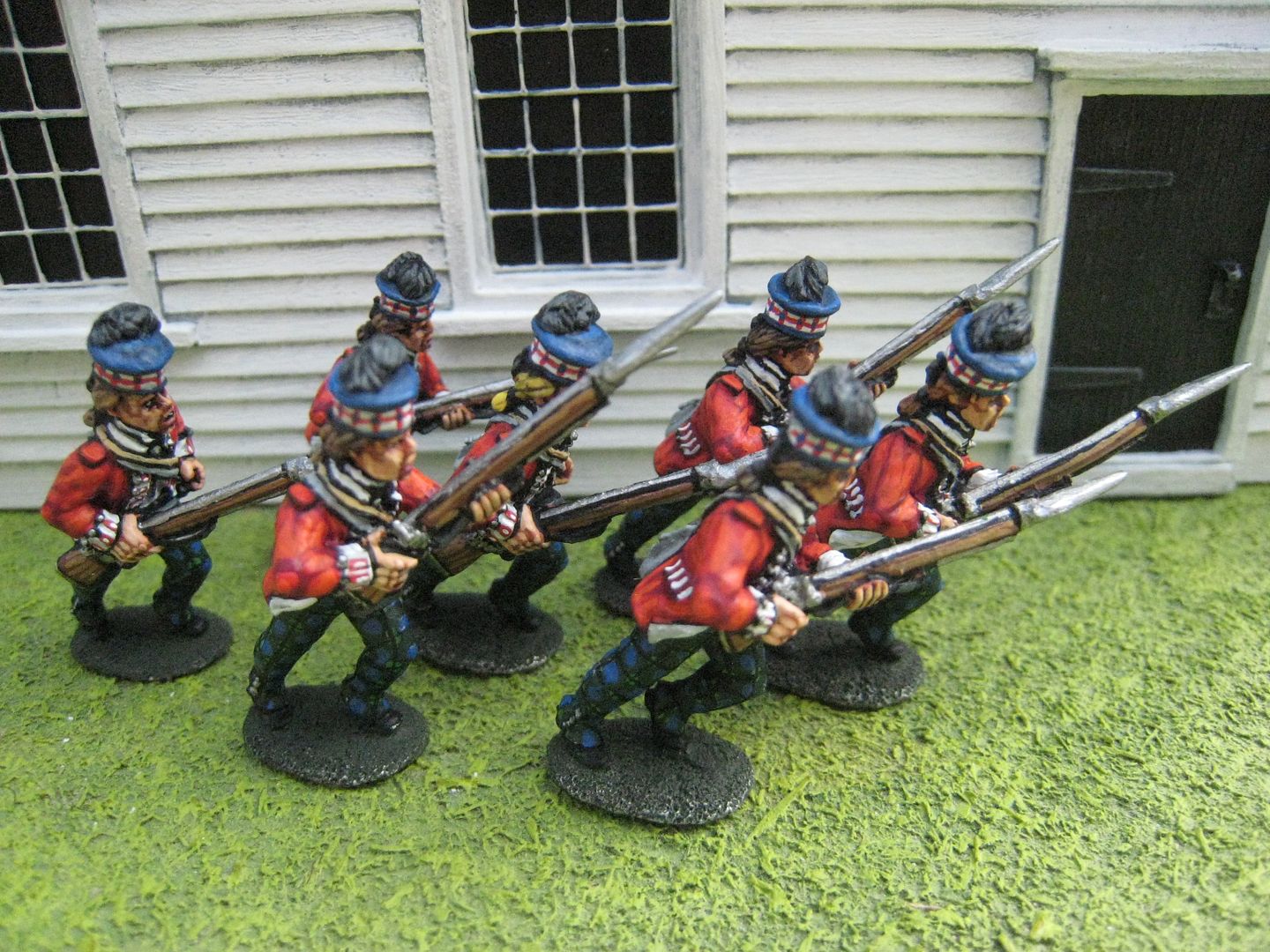
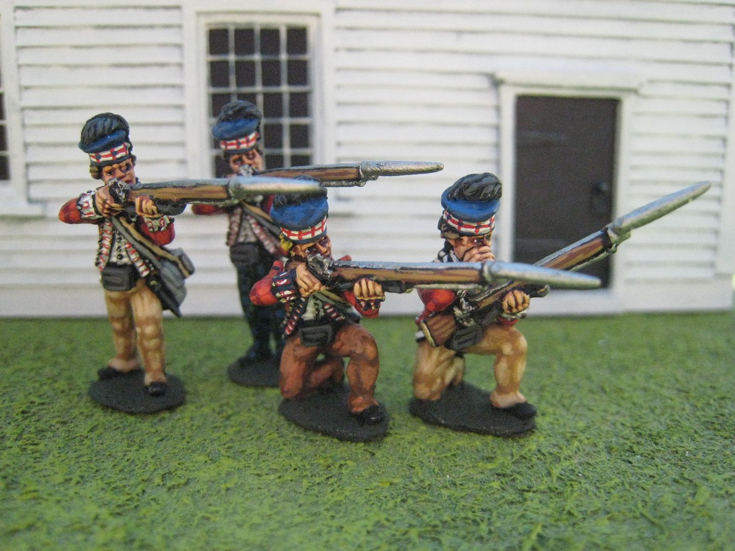
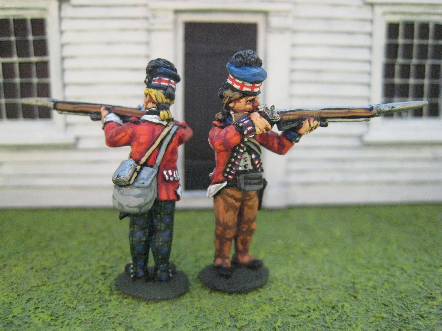
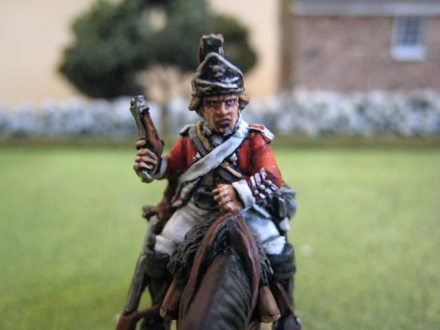
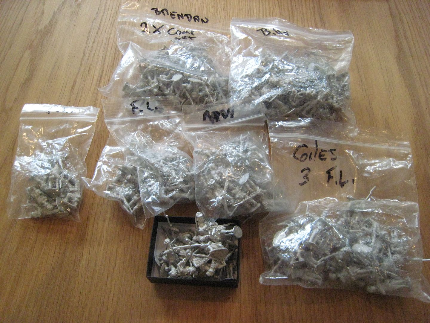
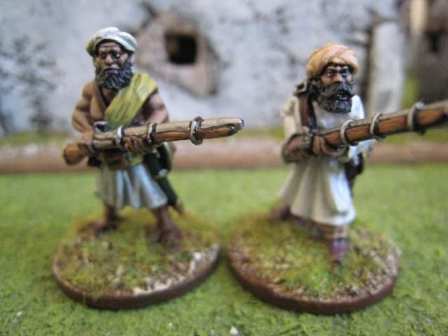
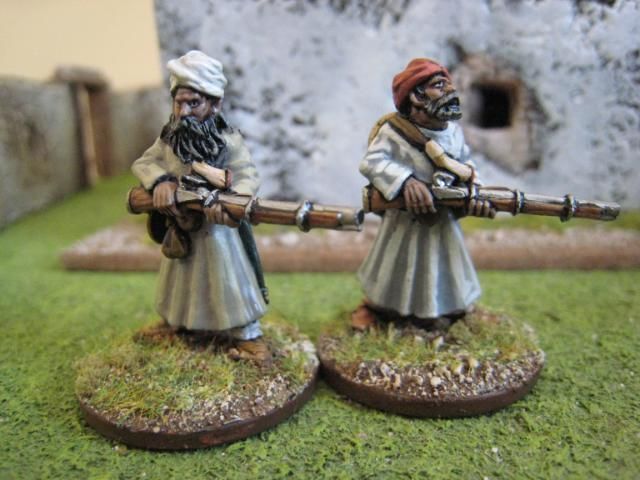
Yesterday I took delivery of about 200 AWI highlanders. These are the rather excellent figures sculpted by Alan Marsh (of Eureka "ragged Continentals" fame) for Bill Nevin of the US and his "King's Mountain Miniatures." Bill wanted figures to represent the 71st Foot in the southern campaigns, and Mr Marsh sculpted various firing line and advancing figures, together with a couple of casualties and forthcoming command figures. Why do I have so many of these figures sitting on the kitchen table? First, I have a substantial number for myself. Secondly, I have been sent figures for onwards transmission to a couple of UK customers. Thirdly, in return for "lead" I have agreed to paint 50-odd figures for Bill's own collection. Phew - I reckon that's most of my painting schedule for the next 4 months...!

Anyway, I have a few days off work at the moment and so I thought I'd post a series of daily posts on painting some sample/test figures from this new range. These aren't Bill's figures that I'm painting, but my own - I'm just trying out some different looks so Bill can see what he might like. My plans for my own figures are not yet fully formed. I want 2 units of the 76th Foot (32 figures) for the "British Grenadier!" Petersburg 1782 scenario, which will probably be 1 advancing unit and 1 firing unit. I then intend to re-do the 71st (I already have 2 battalions' worth
here) for small-scale skirmish actions like Stono Ferry, for which I might look at "Sharpe Practice". The figures are in the same dress as the Perry "later war" highlanders, but in different poses.

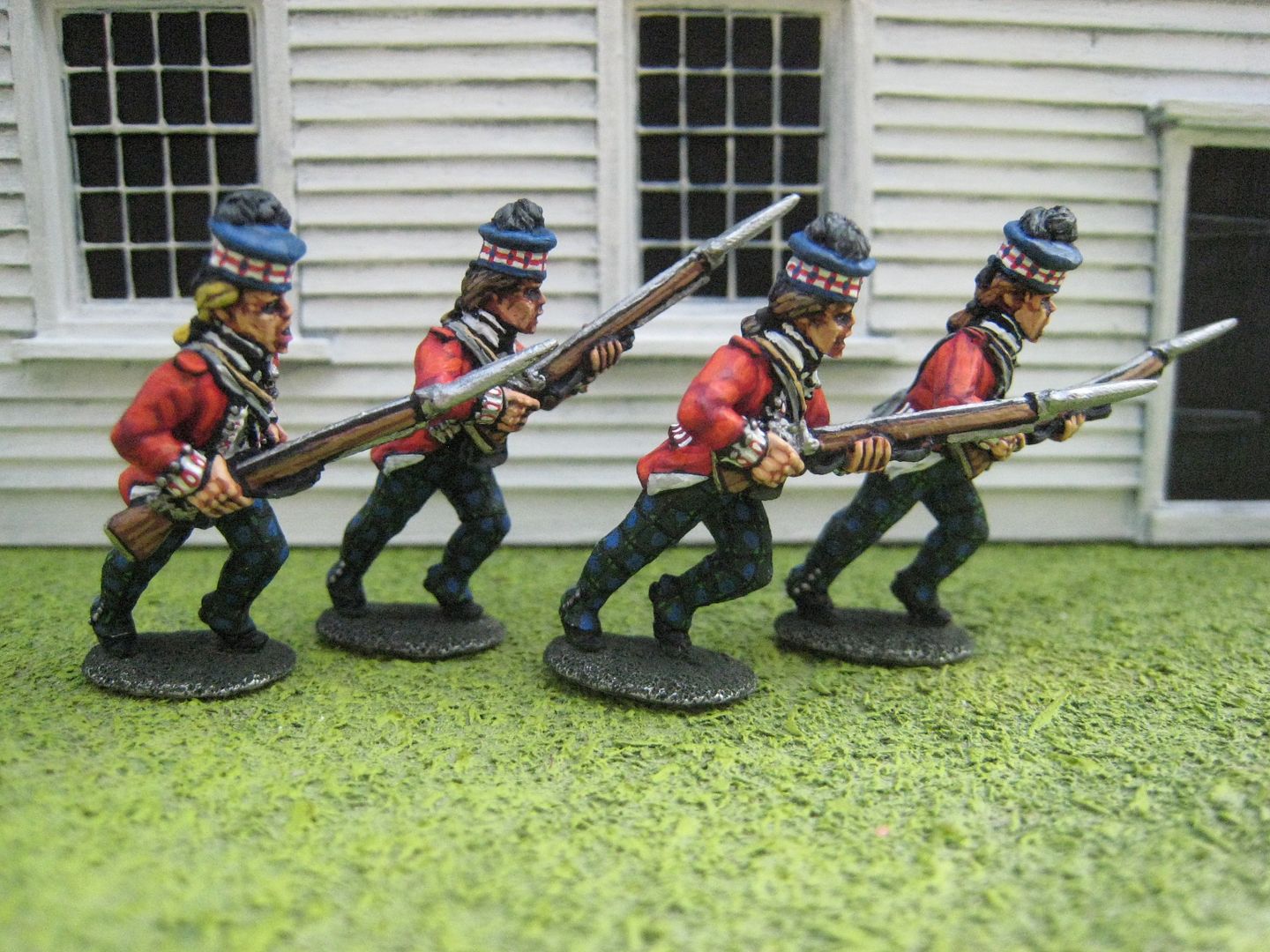
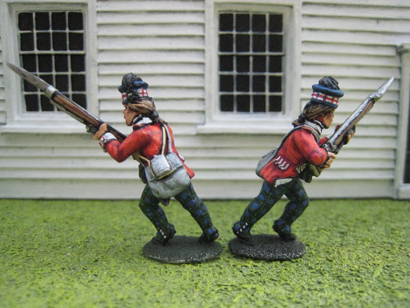
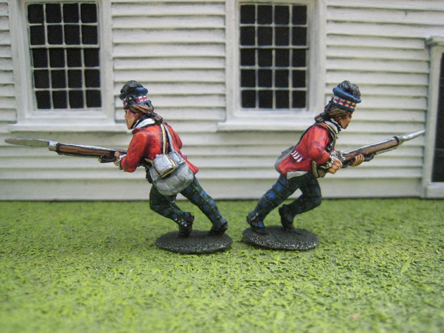
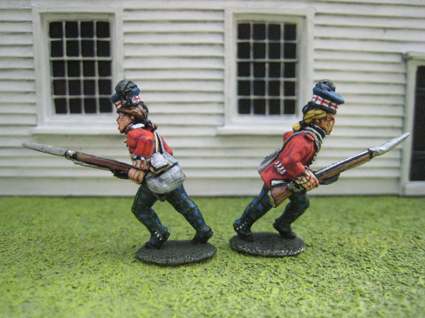
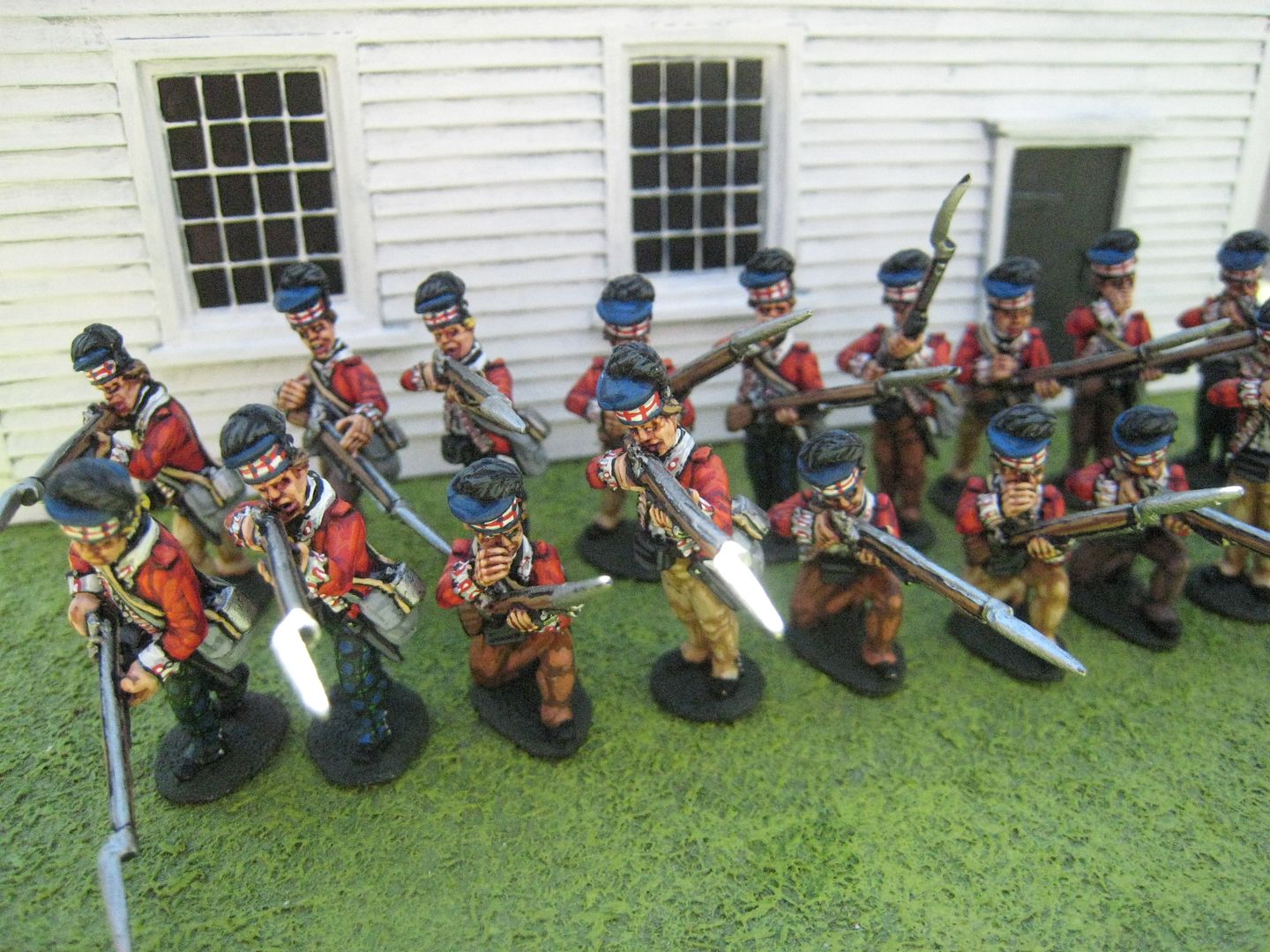
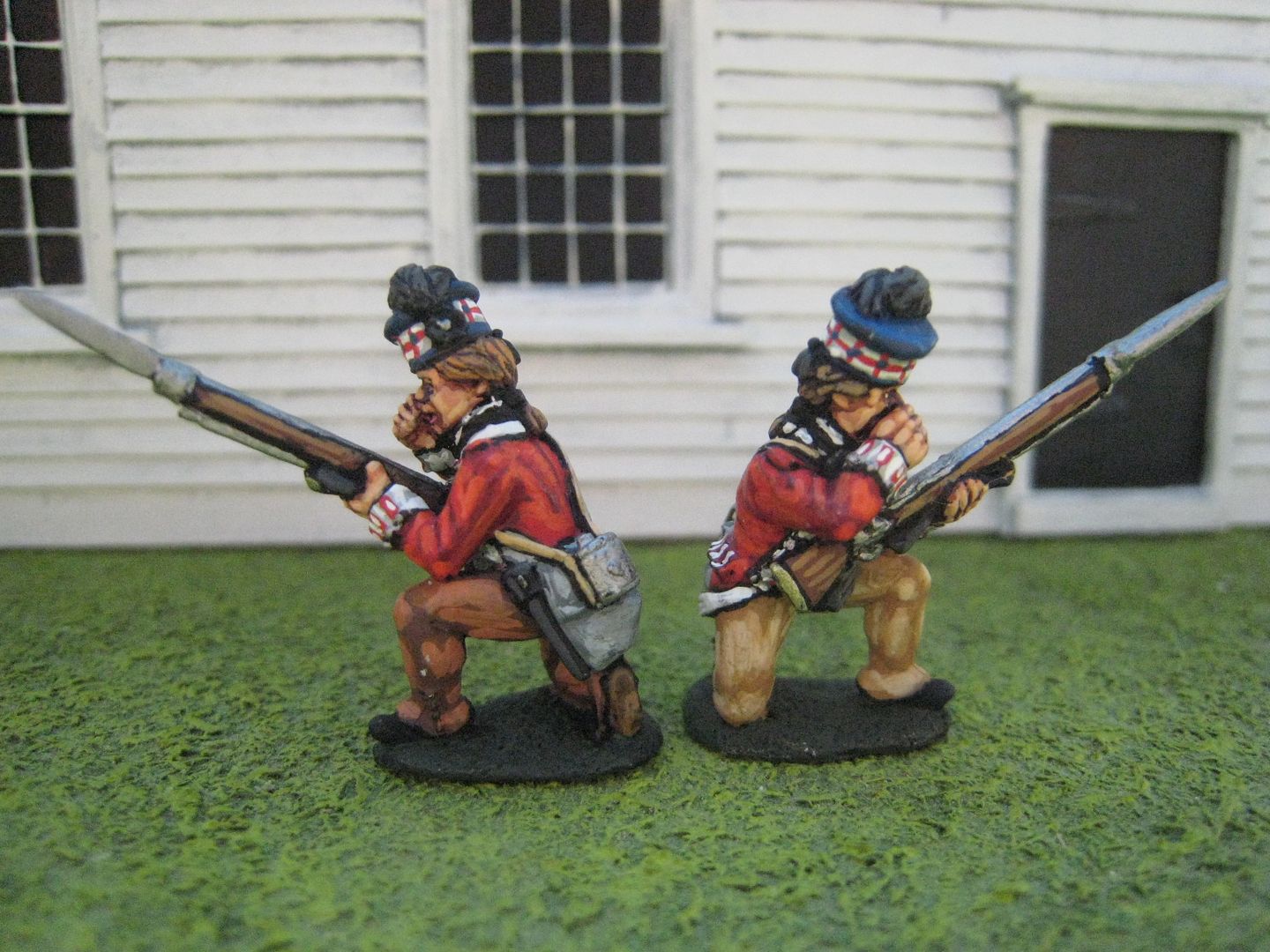
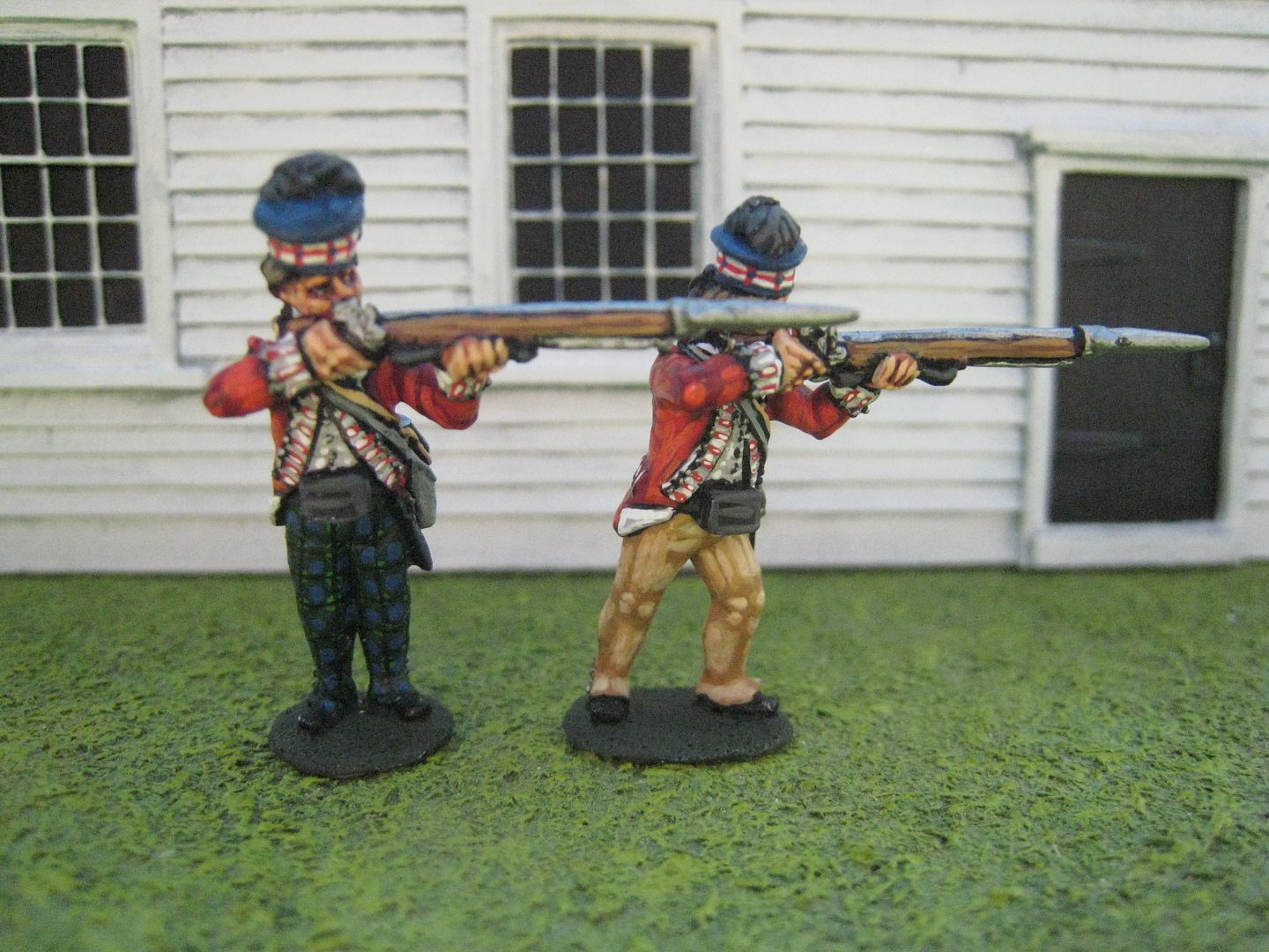
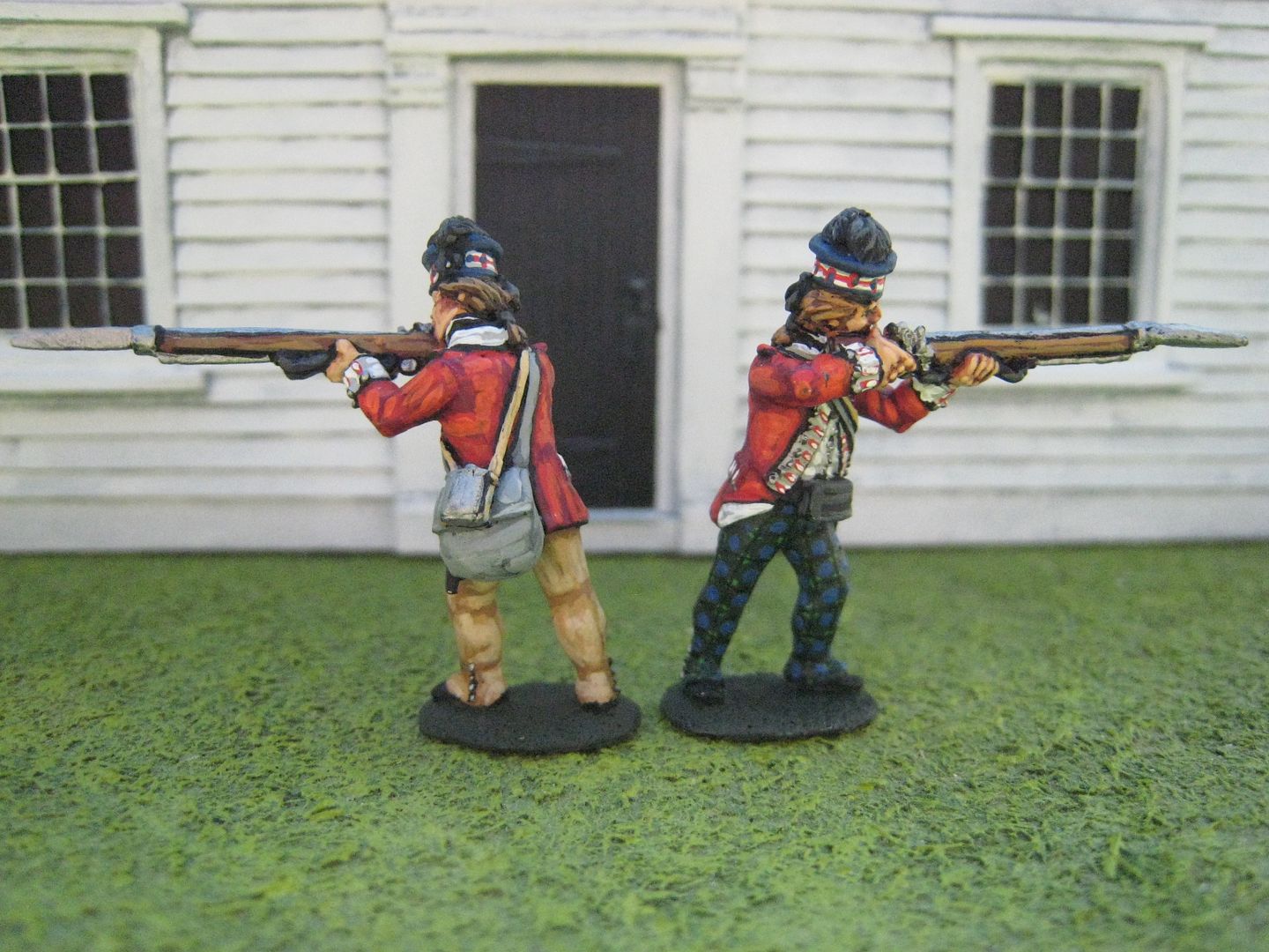
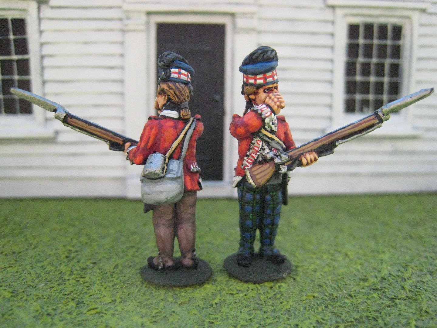
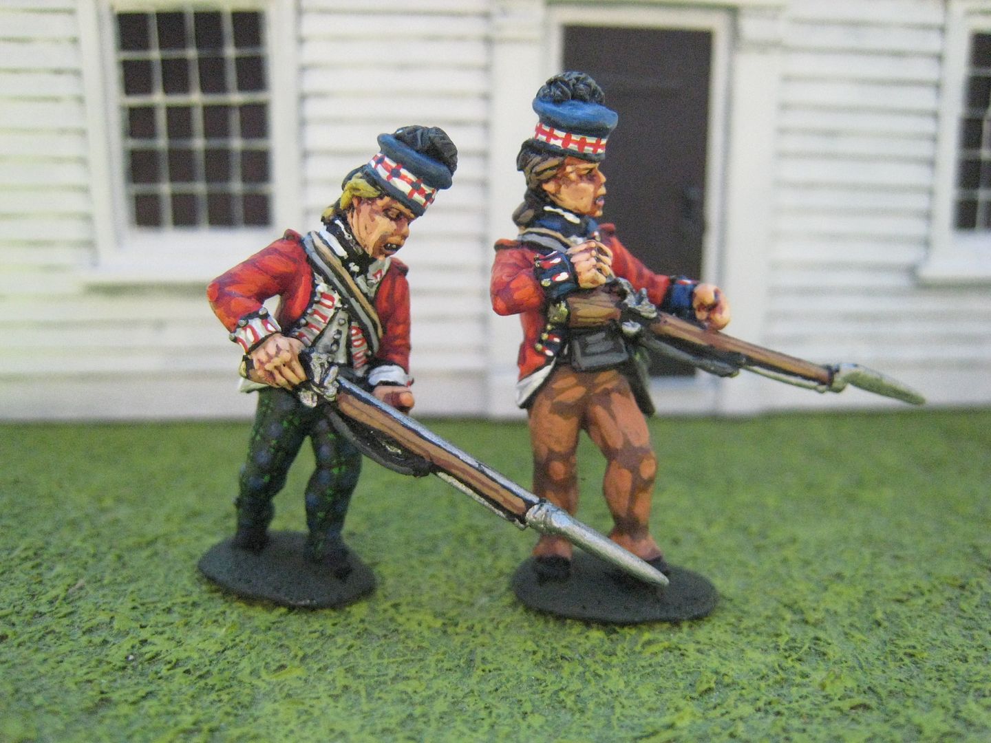
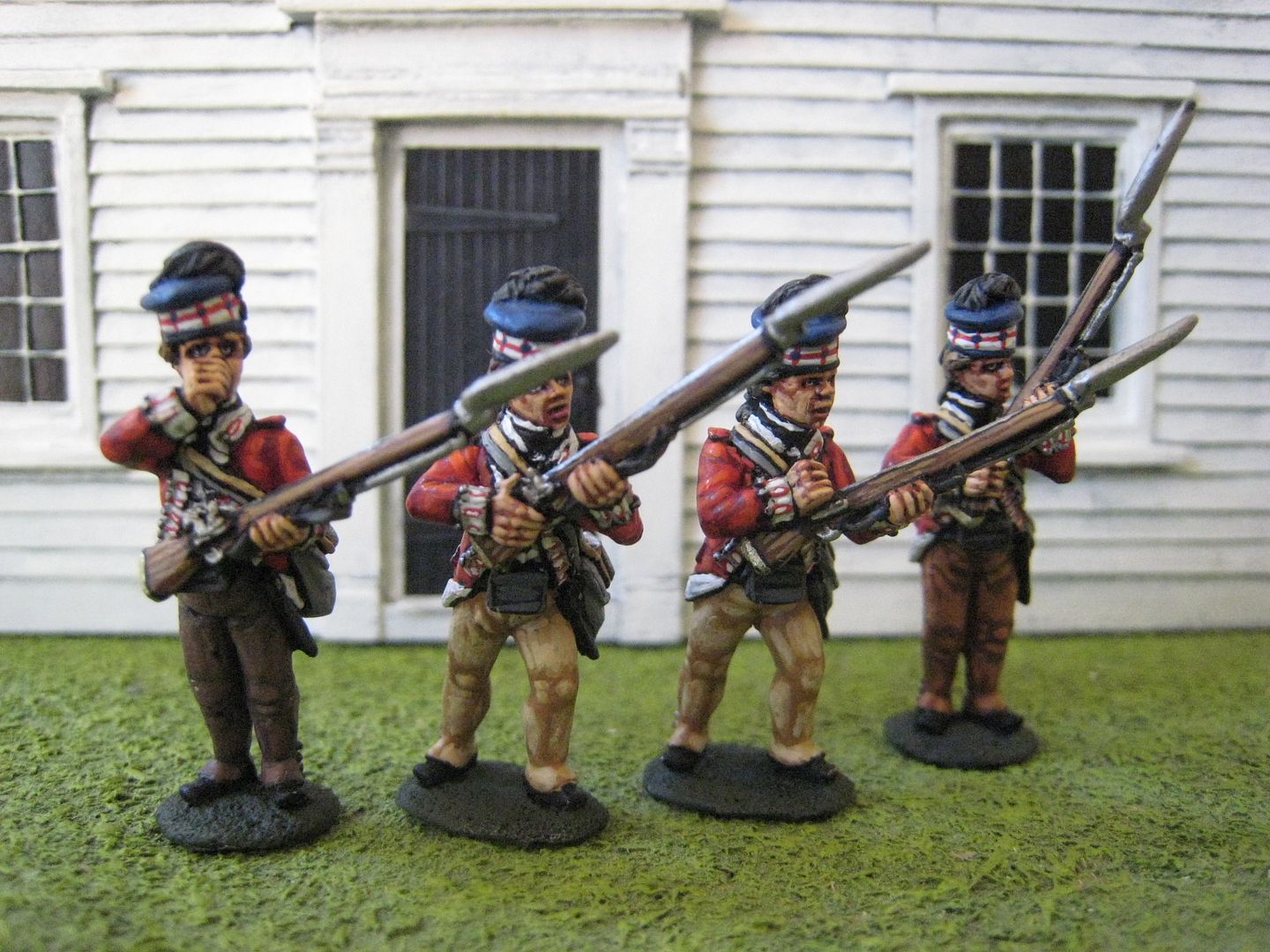
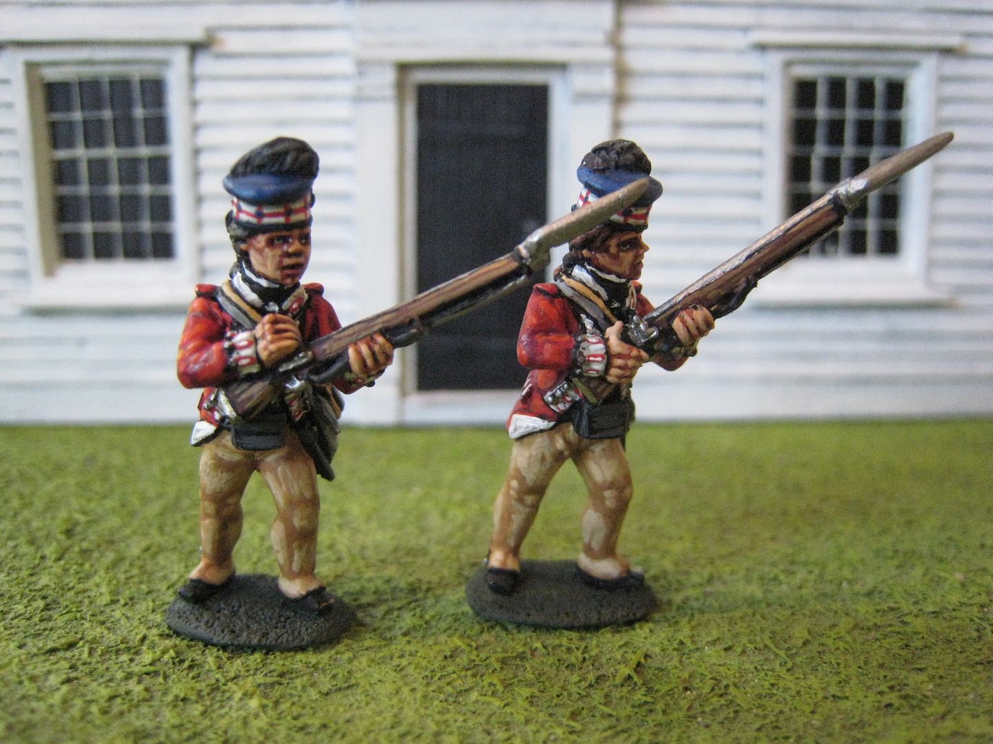
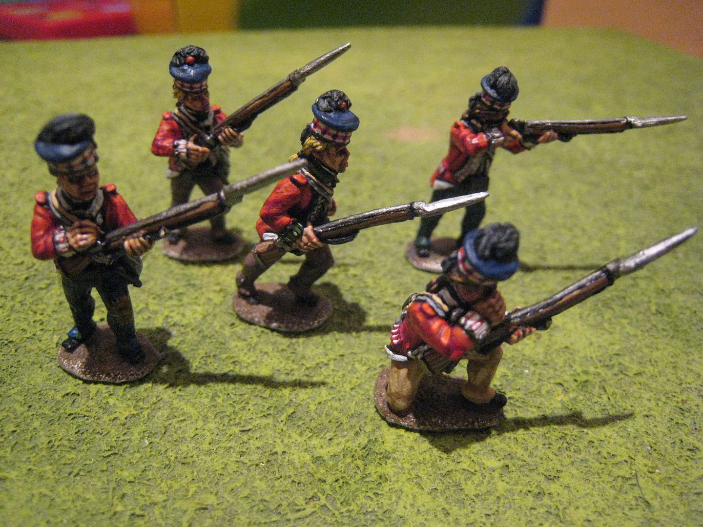
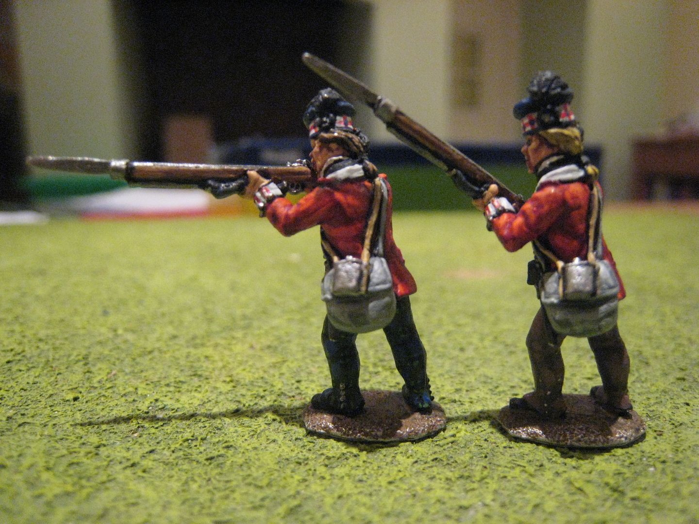
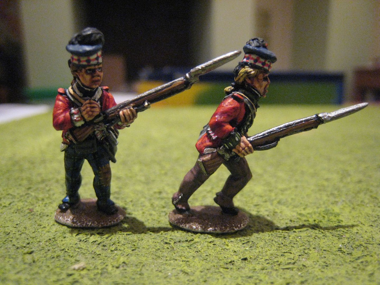
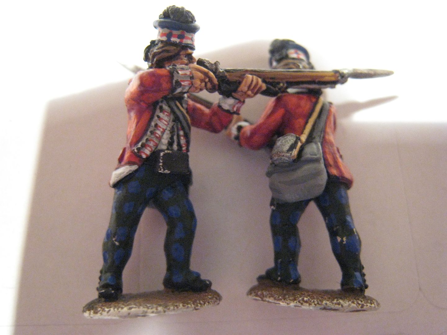
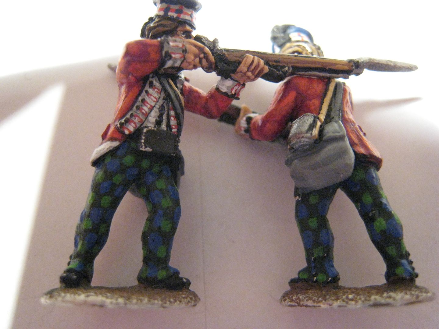
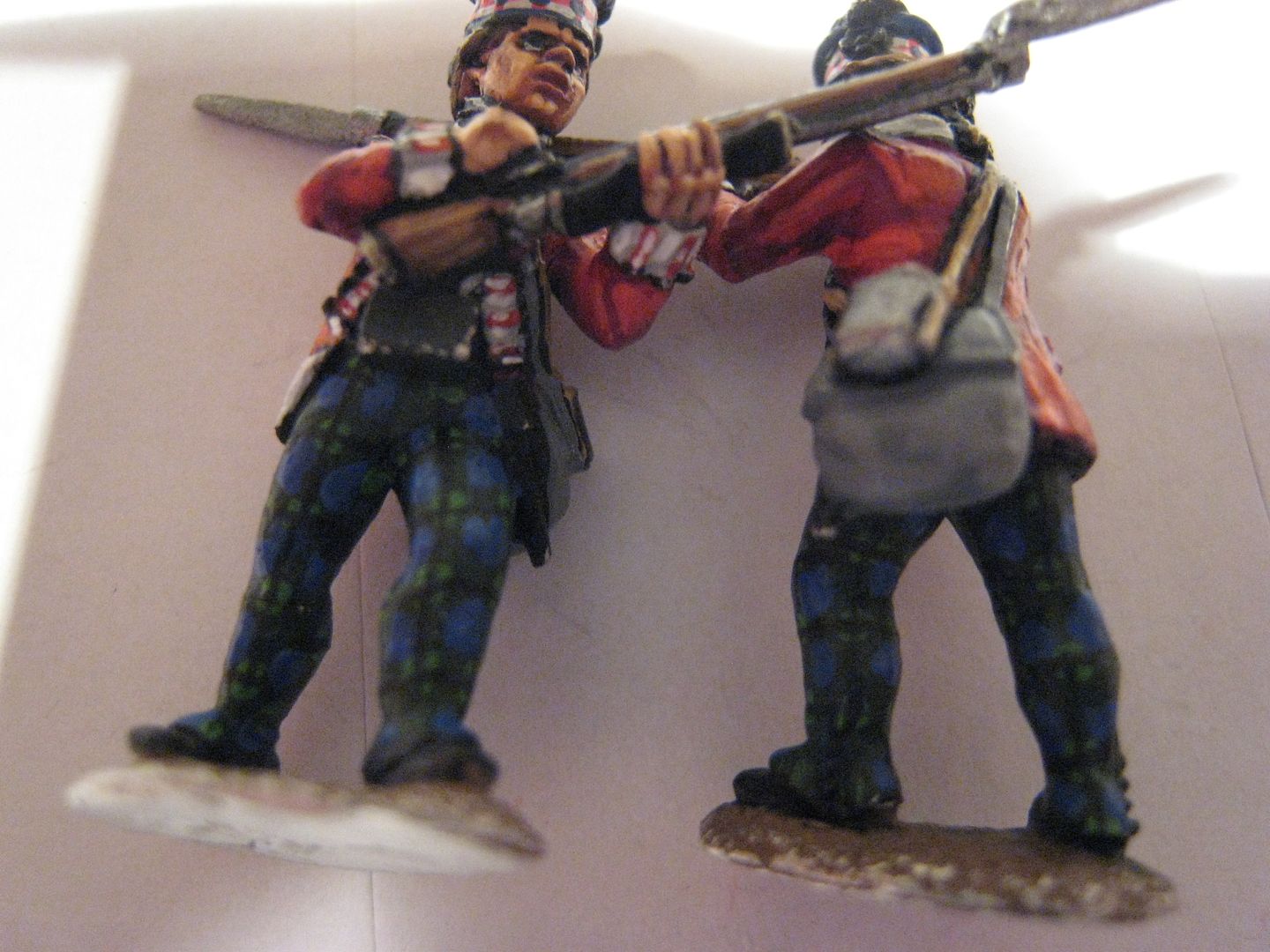
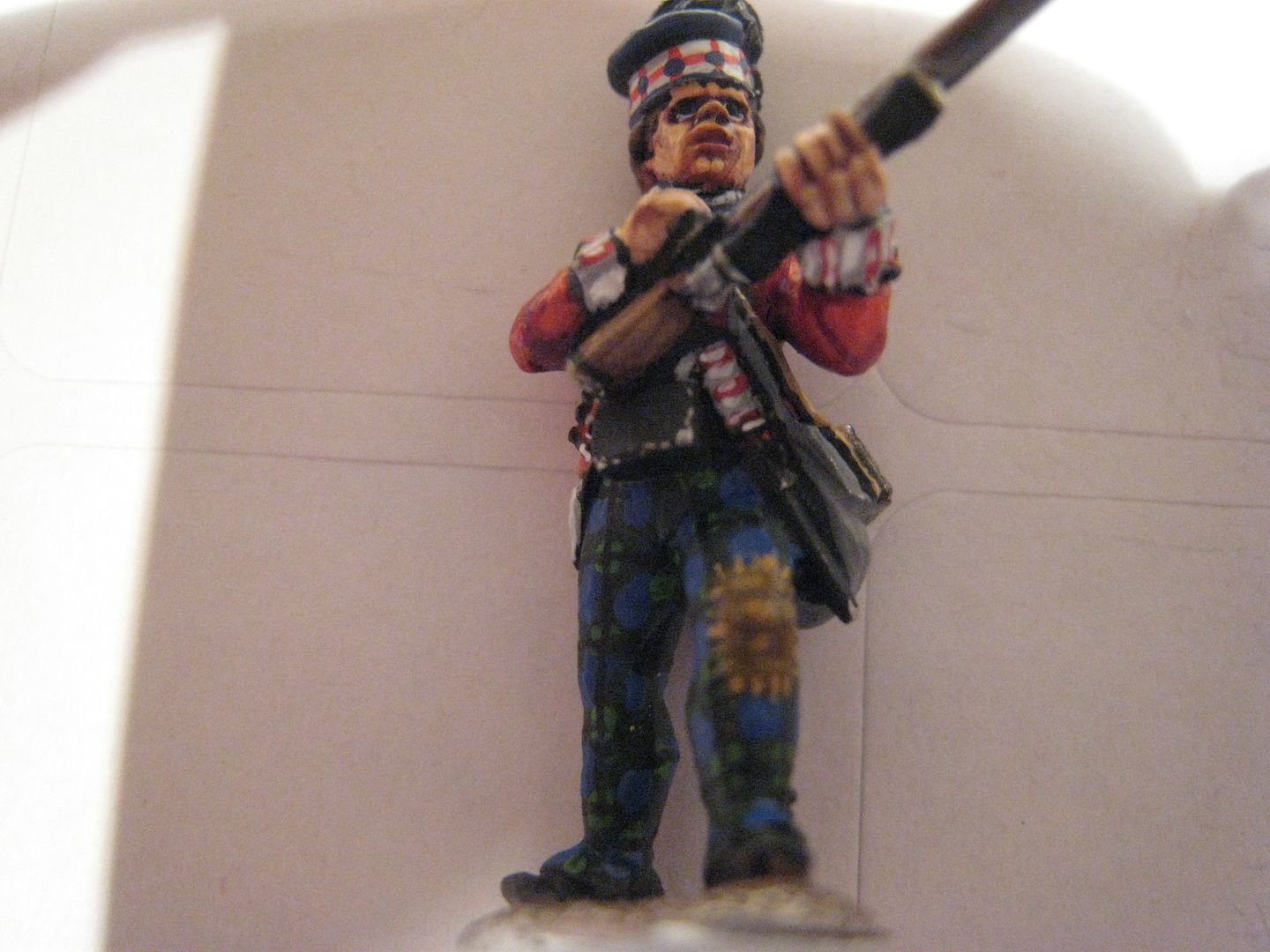
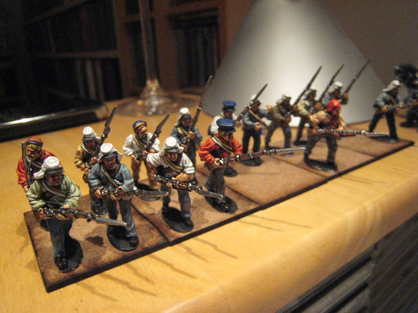
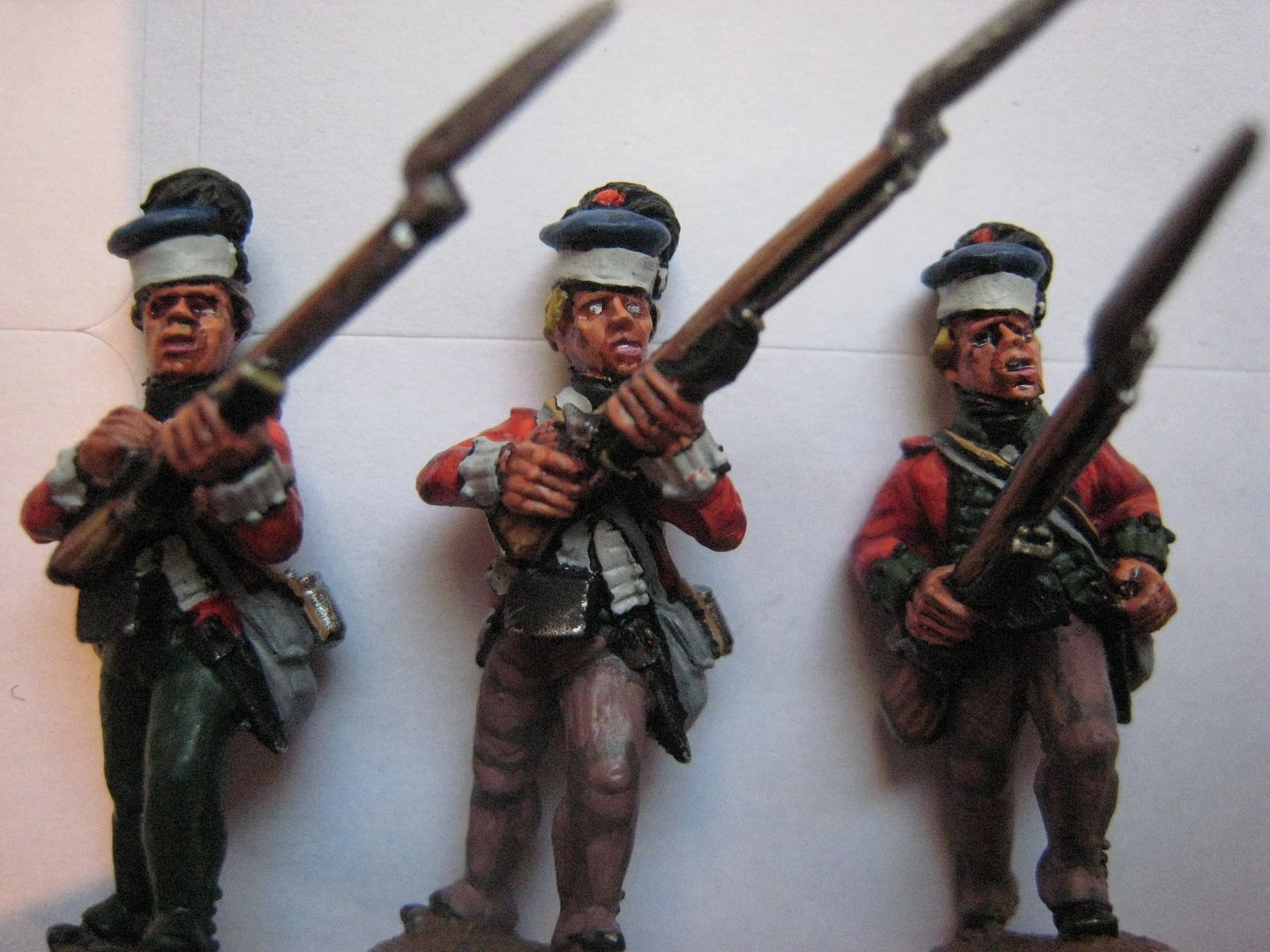
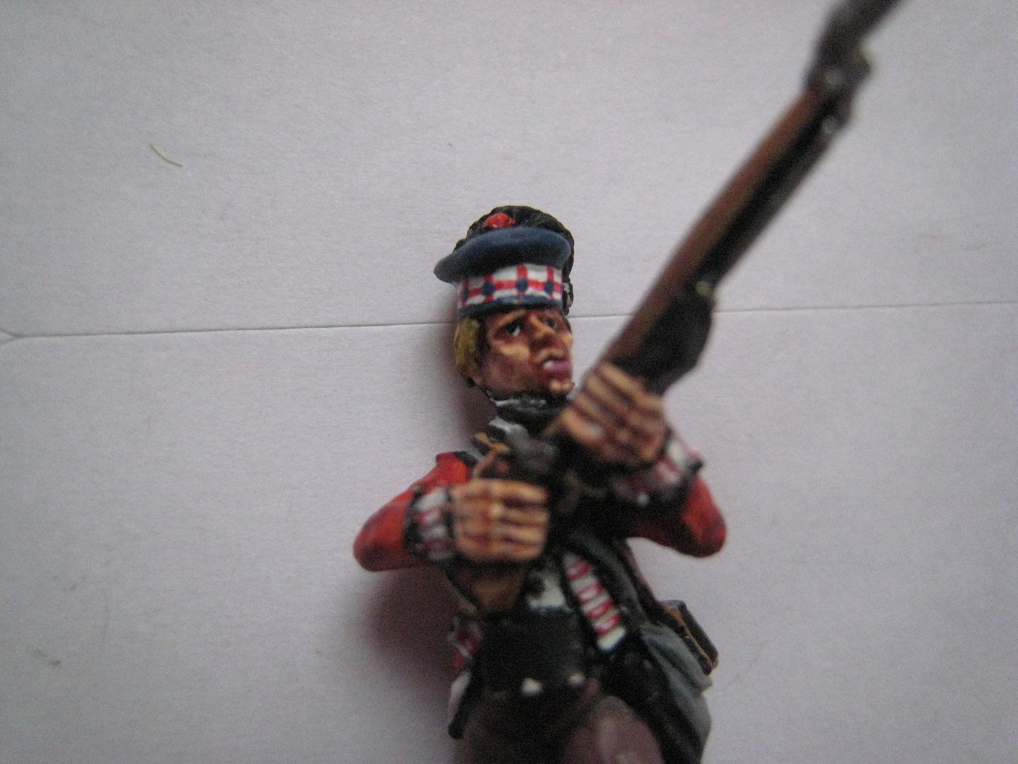
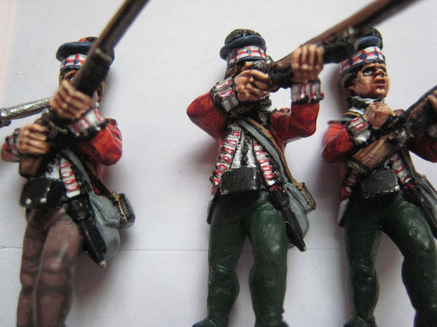
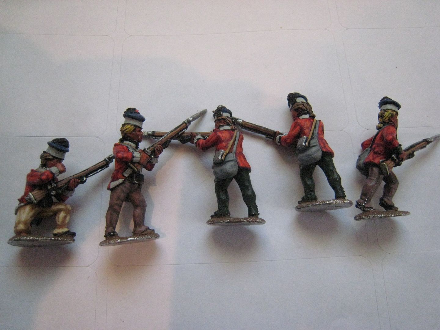
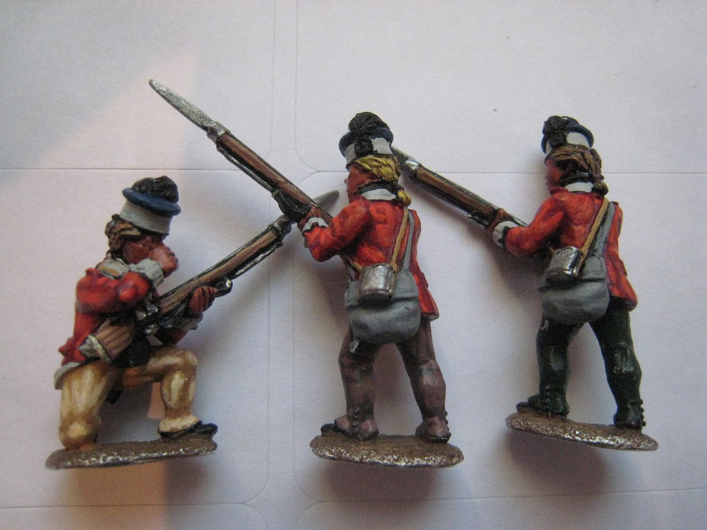
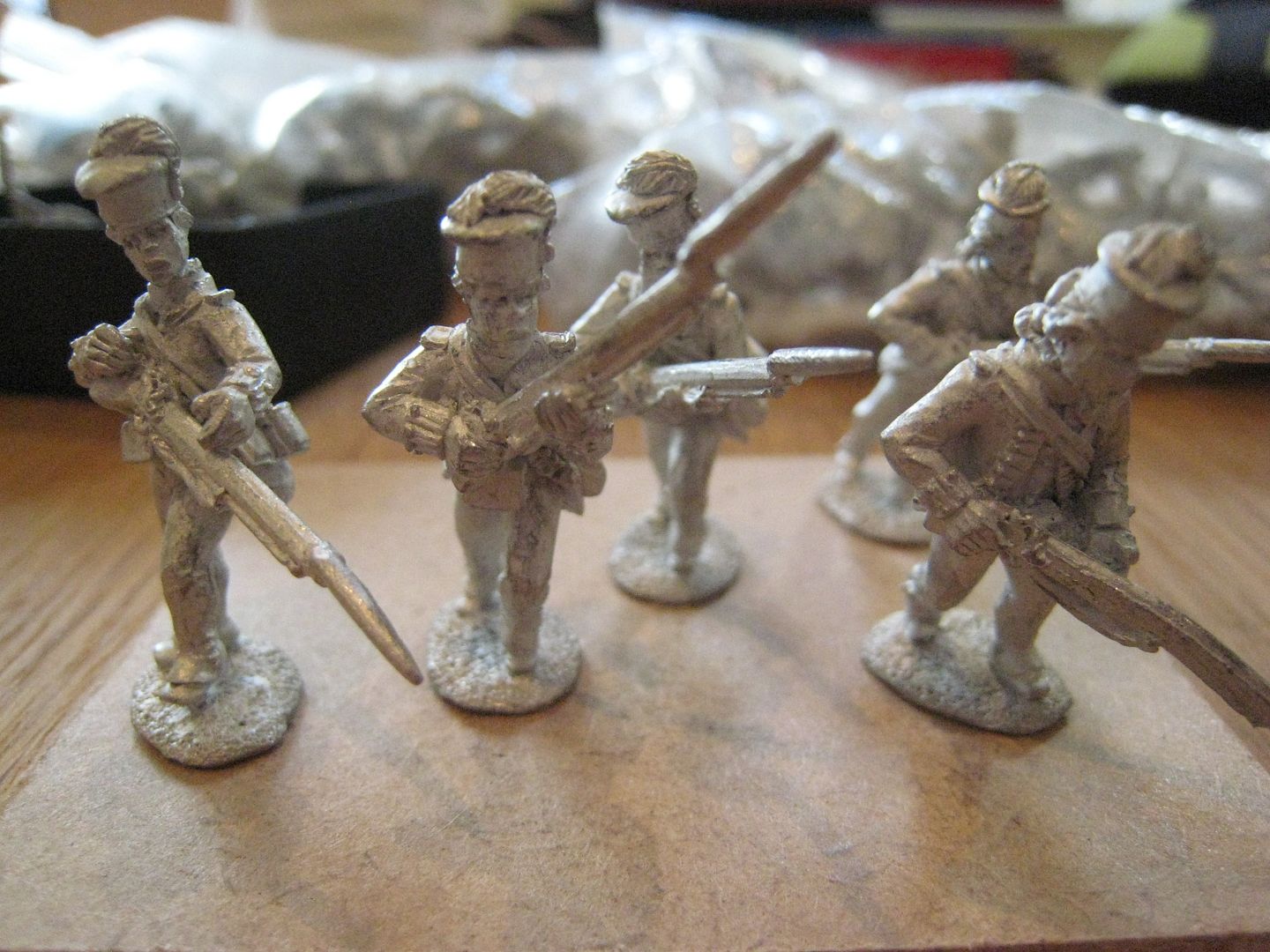
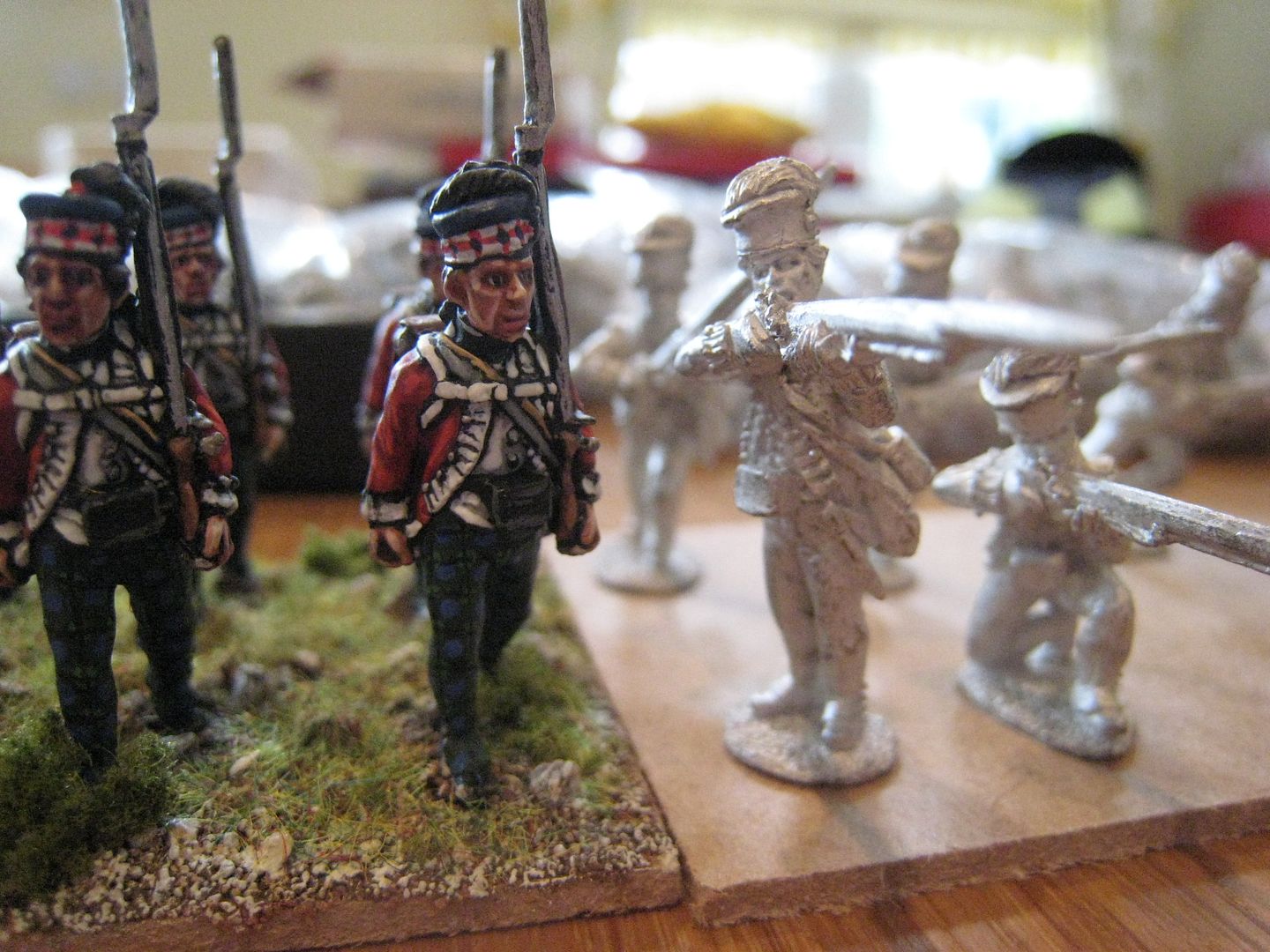
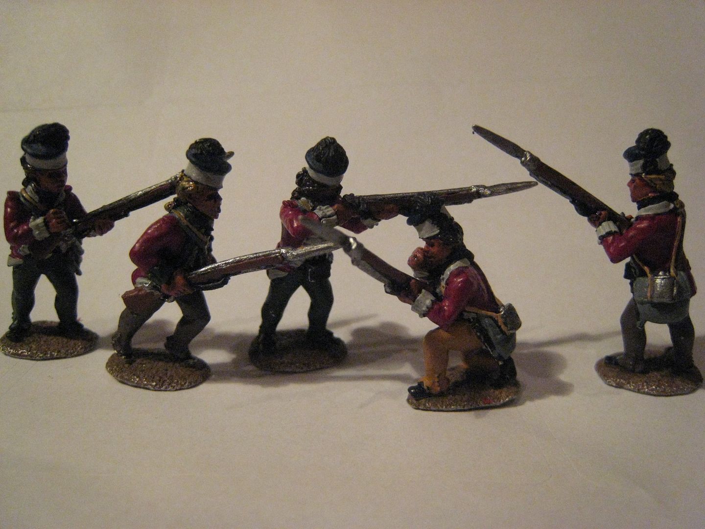
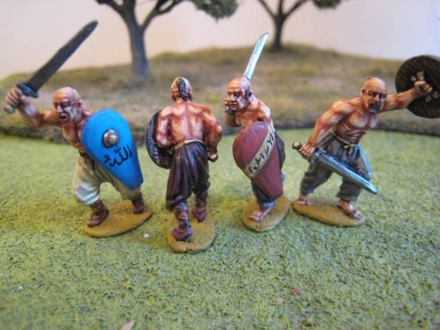
First thoughts are that these figures are very nice indeed. They have zero flash, so tidying up takes hardly any time (jut a bit of filing on the bases). The casting is crisp and the details are well-defined. I am used to Alan Marsh sculpts and his "trademarks" are in evidence here - small buttons, large eye-sockets, open mouths and thin bayonets. The metal is very robust - barely bendable and I am amazed that in their journey from the US to London there appear to be no broken bayonets. So excellent casting. I haven't really looked into all the poses yet, but the firing line has both standing and kneeling figures; the advancing figures could also be described as "charging", I think. In size terms, they seem perfectly compatible with Perry figures - on the left is a photo of my original 71st Foot using Perry figures with the new King's Mountain figures; it's not the best photo, I admit (I painted the 71st back in 2005).

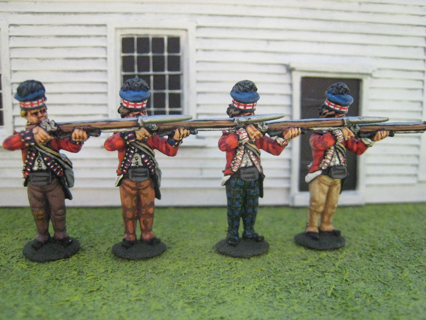
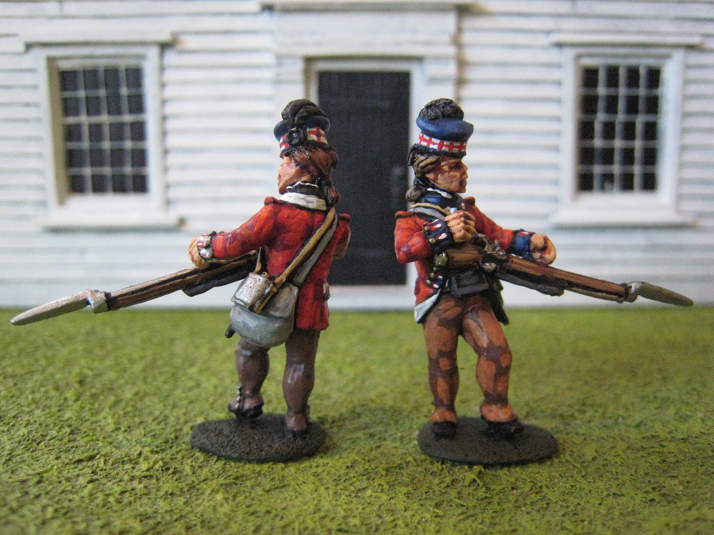
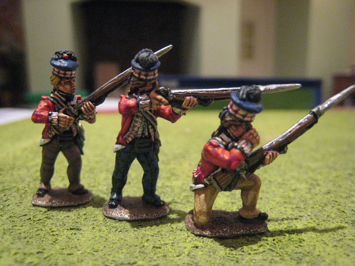
So here's a rather dull photo of 5 figures which now have all the base colours blocked in, over a black undercoat. The exact colours are:
flesh - Foundry "Expert Flesh 127A" with a wash of Winsor & Newton "Peat Brown" ink;
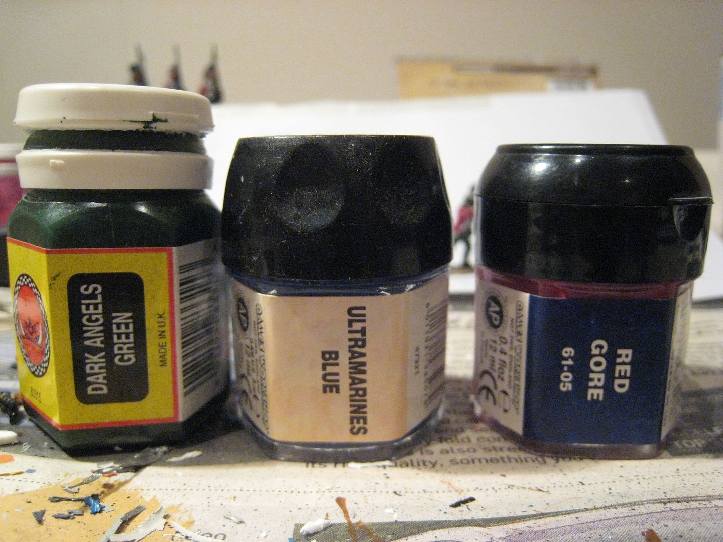
coats - GW "Red Gore" (no doubt called something else now);
muskets - Foundry "Spearshaft 13A" and "Gun Metal 104B";
bonnet - Foundry "Deep Blue 20A";
gaiter-trousers - Foundry "Peaty Brown 61A", "Buff Leather 7A" and GW "Dark Angels Green" (for tartan trews);
haversack - Foundry "Stone 57B";
canteen strap - Foundry "Canvas 8A";
facings - Foundry "Arctic Grey 33A" for the 71st and "French Dragoon Green 70A" for the 76th. The next stage will be to do most of the highlights on the equipment and clothing. I'll do that today. I don't usually block out the entire figure - my normal method is to highlight as soon as each base coat has dried. I used to paint the flesh first, but now leave it until the end of the process.

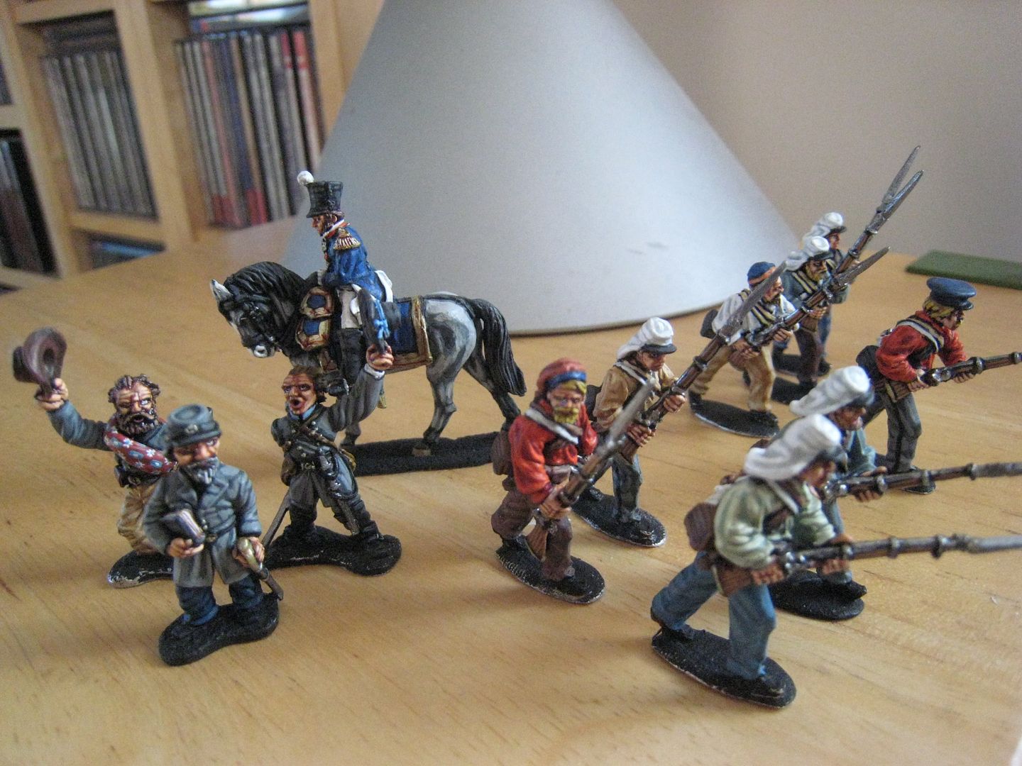
The paint I'm using as the base coat for the tartan trews must be one of the oldest in my collection of paints - an original Citadel plastic pot from, and I'm guessing, about 15 years ago? It's still going strong, along with several others of similar vintage. The photo here shows the two successor paint pots from GW - the one in the middle was the worst, as everything tended to dry up after a couple of months. The pot on the right was much better, but then they changed that and brought in the current smaller sized pot. As well as the highlanders, I'm working on a couple of other things at the moment. The wip shot below shows Virginians for 1861 Bull Run, the first figures for a Dixon Stonewall Jackson vignette and a French colonel for a 1815 General Bachelu command stand. I'm working on those alongside the new highlanders.